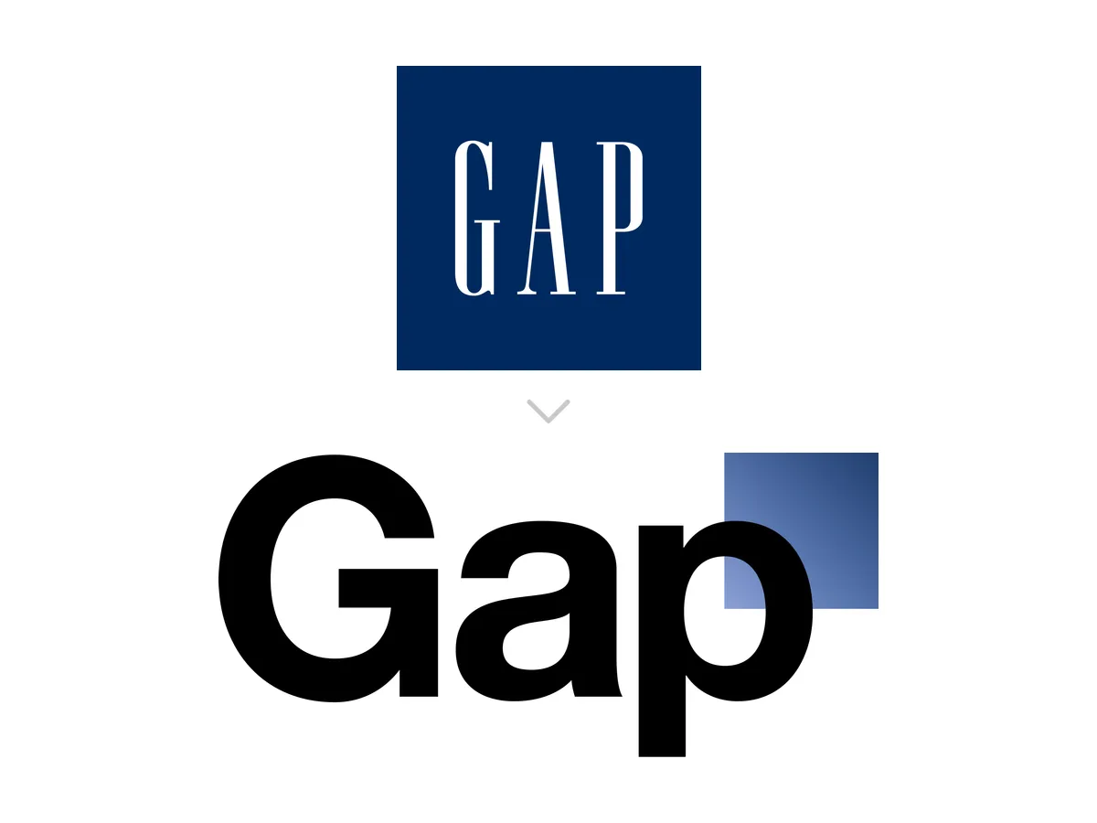
 Gap
Gap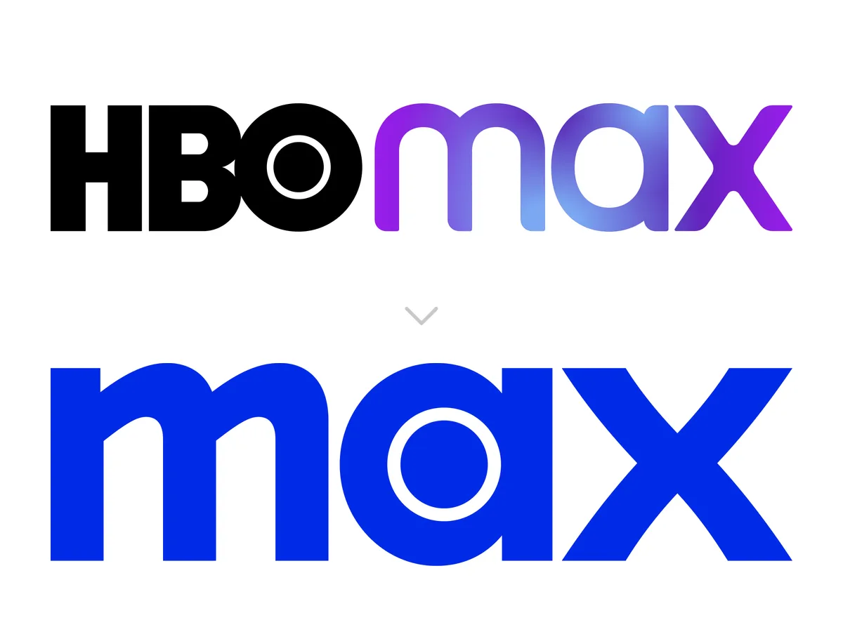 HBO Max to Max
Worst Corporate Rebrand in History
Choose your bracket size
Tap a size to start playing — free, no sign-up.
A rebrand is the rare corporate decision that everyone outside the company gets to grade, which is why the bad ones are remembered for decades.
Each card shows the same thing twice: the identity a company spent years building, and the one they paid an agency to replace it with. Gap put a Helvetica box on its storefronts and took it down six days later. Cracker Barrel removed the old man and the barrel, which were the only two things in the logo. Jaguar announced Copy Nothing and then removed the cat. HBO Max dropped the three letters people were paying for and put them back two years later. None of these were accidents. Every one of them was presented in a boardroom, approved, and paid for.
The ones that got reversed are here next to the ones that stuck, because surviving is not the same as being good. Some of the worst decisions on this list are still on the storefront.
Pick the one that did the most damage. Most people find the final comes down to a logo they can still picture and a name they still refuse to use.
Who's in it
5 of 22 — the rest stay hidden until you play
Full results — spoilers ahead
Ranking Kellogg's to Kellanova
 Xerox
Xerox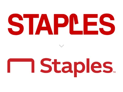 Staples
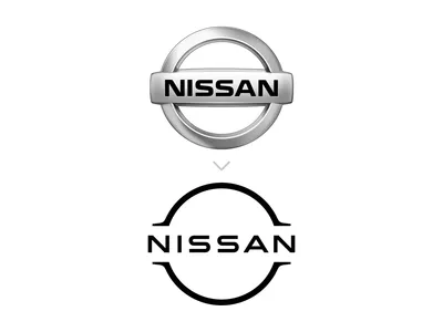 Nissan
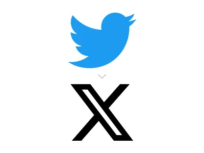 Twitter to X
- +15 more
More brackets
Play another bracket
 Golden Retriever
 Labrador RetrieverBest Dog Breed28 plays
 Red Panda
 Sea OtterCutest Animal on Earth15 plays
 The Starry Night
 Mona LisaGreatest Painting of All Time7 plays
 Pillars of Creation
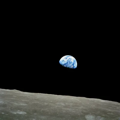 EarthriseMost Stunning Space Photo5 plays
 Peak Foliage
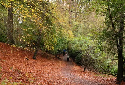 Crunching Through LeavesBest Thing About Fall
 Stronger
 Crazy in LoveBest Sample Flip